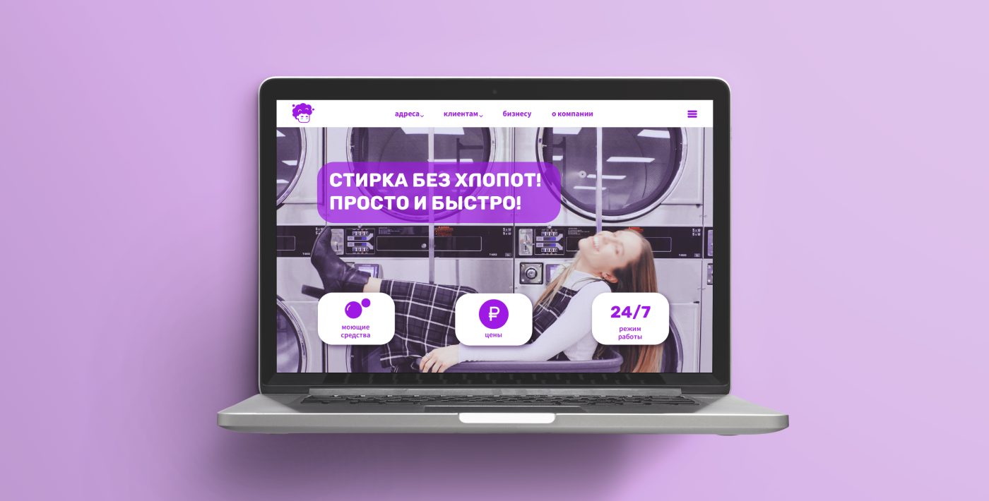

О проекте
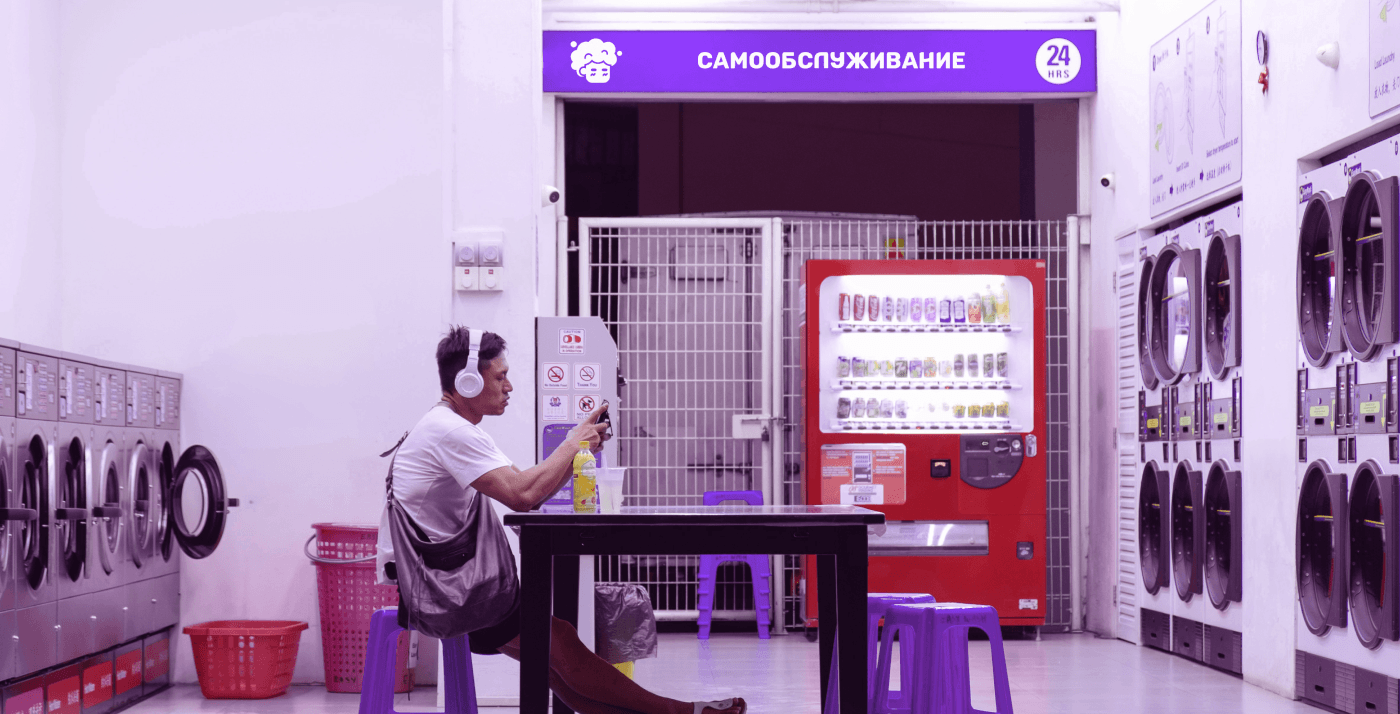
Mойка — это сеть круглосуточных прачечных самообслуживания по г. Санкт-Петербург.
Эта сеть предоставляет людям отличную возможность постирать и высушить свои вещи не напрягаясь,
с чашечкой кофе и телефоном в руках.
Задача
Разработать минималистичный логотип, который будет выделять компанию среди конкурентов.
About the project
Moika is a chain of 24—hour self-service laundries in St. Petersburg. This network provides people with an excellent opportunity to wash and dry their clothes without straining, with a cup of coffee and a phone in their hands.
Task
To develop a minimalistic logo that will distinguish the company from competitors.
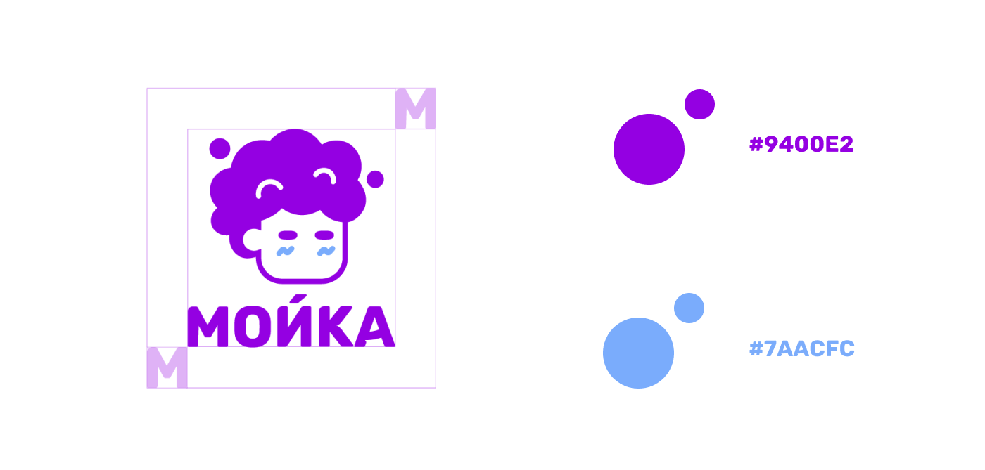
О логотипе
Так как целевой аудиторией данной прачечной являются молодые люди в возрасте от 25 до 30 лет, было принято решение создать логотип в виде лица парня, чьи волосы напоминают пену, что отсылает
на сферу деятельности компании.
About the logo
Since the target audience of this laundry is young people between the ages of 25 and 30, it was decided to create a logo in the form of a guy's face, whose hair resembles foam, which refers
to the company's field of activity.
to the company's field of activity.
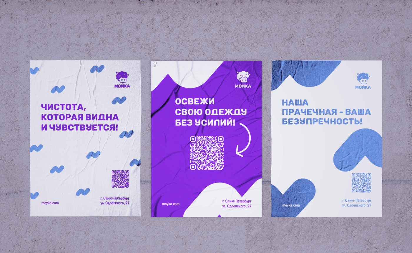
Выбор фирменного цвета
Прачечная "Мойка" отличается от конкурентов тем, что у них есть техника для УФ-дезинфекции белья. Данная техника обладает способностью испускать фиолетовое свечение, и именно по этой причине фиолетовый был выбран как основной цвет компании.
Choosing a corporate color
The "Moika" laundry differs from competitors in that they have a technique for UV disinfection of laundry. This technique has the ability to emit a purple glow, and it is for this reason that purple was chosen as the main color of the company.